Three months ago, I was wasting time on HN as usual when I saw this post, about someone's "brutalist hacker news". I wondered what could be more brutalist than HN already was. Just plain HTML, no CSS? A text file? Anyways, it was not something I would call brutalist. For those who can't be bothered to open the page, it has a nav bar with a bunch of emojis instead of words, which had some glitchy[0] animation, and it had a list of article titles underneath, which loaded after some weird glitchy text animation played. It is something that I would not call brutalist in any sense.
I was about to write a sarcastic comment, but gracefully decided to write a blog post about my thoughts on brutalist web design instead. Of course, as all blog posts are classically made, I created the file for this post and then left it untouched for 3 months until I decided I should probably finally write something for once.
Back on topic, the author cited brutalist-web.design[1] which claims the following as tenets of brutalist web design:
- Content is readable on all reasonable screens and devices.
- Only hyperlinks and buttons respond to clicks.
- Hyperlinks are underlined and buttons look like buttons.
- The back button works as expected.
- View content by scrolling.
- Decoration when needed and no unrelated content.
- Performance is a feature.
Well, that's weird. Most, with the exception of the 6th bullet point, seem mostly like what people would expect of a decent normal website, as opposed to anything specific to brutalist design (Fellas, is it brutalist to have a usable website?).
Now let me read what the brutalist-web.design guy has to say about that very load-bearing 6th bullet:
A website is neither an application nor a video game. It is for content, and so its design must serve that purpose. Being true to these materials need not imply a boring website or require that all sites look the same.
Well, I suppose that seems reasonable, though I'm not sure if this is specific to brutalist design. I'm going to skip the next paragraph and go to the last two:
Decoration for its own sake, often to satisfy the vanity of the designer, goes counter to Brutalist Web Design. Such needless decoration distracts the visitor from the reason for visiting and makes the content secondary.
OK... that does seem like a brutalist sentiment.
The same can be said of unrelated content, such as misleading links, sensationalist headlines, or distracting images. These all attempt to take the visitor away from the content either for advertising or to create a false increase in engagement. Effort should be spent on compelling content, not trickery. Content drives engagement.
Sure, clickbait is bad. I would agree that sensationalism and advertising do seem contrary to the barebones spirit of brutalism... "content drives engagement", though? At least for me, the word "engagement" seems a little opposed to what brutalism is.
So, sure, I agree on some points, but overall I don't think this is a good definition of brutalism or brutalist-style websites. But that got me thinking, what exactly do I think brutalism is?
As with most things as I have strong opinions on, once I tried to actually examine what I knew and believed, I realised beyond the surface, it was pretty murky down there.
Anyways, after some thinking and a skim of the brutalist architecture article on Wikipedia, I think brutalism (in terms of web design) is better split into two separate categories. Sincere apologies for the spoiler in the title.
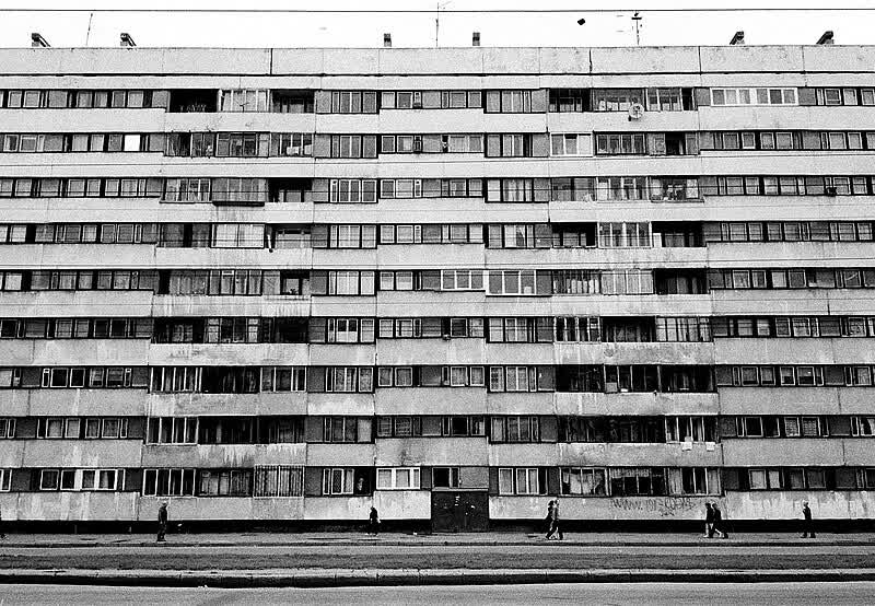
Photo by lafleur (license)
The first type is what I'll call the "soviet apartments", named so because like the apartments, they use bare, basic building materials, only have essential structure, and the minimum required to make it work. The colours are grayscales (or most commonly for websites, but not really buildings, black and white).
Though they can be a political statement, they don't necessarily need to be - in fact, I would very un-scientifically say they typically aren't. These websites are the way they are because it's incredibly easy to build them, and the authors don't see the need for anything fancier.
These "soviet apartment"-style websites are usually so because they don't need to have anything extra. They might be some HTML with a few lines of CSS perhaps adding some margings, line spacing, and a font. They might be just plain HTML. They might even be a text file with lines broken up every 80 characters.
If I were to make a very unsubstantiated claim, I say that the main political message of this kind of website is one that is against bloat, excess, and one that yearns for a simpler past.
This style of website isn't flashy or attention grabbing - it's built to serve a simple purpose, do nothing unnecessary, and it does it well.
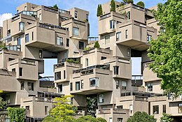
Photo by Denis Tremblay (license)
The "Habitat 67s", on the other hand, are in many ways the opposite, yet still put under the brutalist umbrella.
Like the "soviet apartments", they use bare, basic building materials, and do the minimal required, they do so in a completely different way. Notice, "Habitat 67"s are not composed of only essential structures - rather, they are artistic in structure with weird little juts and shapes.
This style of brutalist website often has a bizzare, even surreal look, with unusual or unfashionable fonts, and an unconventional layout. Most importantly, they try to violate as many web design principles as possible.
In other words, they intentionally try to be conventionally "ugly". To a regular person, these sites may look like someone just discovered how to add text and images in MS Paint.
"Habitat 67"-type websites are a lot more deliberate and political than "soviet apartment"-style websites. These websites are a huge "fuck you" to modern mainstream web design. You know what I mean. Obnoxiously round buttons, the sans-serif font on every other website (and a generic colour scheme to match!), shiny images, smooth gradients, and CSS (or SVG) animations that are admittedly pretty damn cool, at least if this wasn't the 100th time you've seen that exact animation trick. Bonus points for unnecessarily large images (in terms of file size), and a megabyte of minified Javascript. Super bonus points for guessing what framework they used to make the site. Just guess, you have an 1 in 3 chance of getting it right, anyways.
Many examples of these websites can be seen at this site, though the site has a few "soviet apartment"-style websites too. Fair bit of warning: at least for me, it doesn't ever seem to finish loading, but you can still scroll and see the images.
More broadly, the philosophy behind this kind of design might be a general backlash against the genericness and homogeneity of the modern web monoculture. Now, you've realised that I've more or less abandoned objectivity, so I'll go out and I would like to say to designers that modern does not look sleek, and has not for years. Please try something different! Put down your Tailwind and Bootstrap, your UI components, and make something that doesn't look like the slop of every other website trying to sell you some bullshit[2]. The initial novelty and awe have long wore off, and frankly if I had to choose the web to be infested by a single horrible design style I would choose the Wordpress era over this.
Anyways, I was going to write a conclusion but I think that previous paragraph more or less does it. Thanks.
===
Footnotes:
- [0]: Glitchy not as in "not working properly", but the visual effect
- [1]: Oh yeah,
.design is a tld, apparently
- [2]: Nowadays, even non-corporate websites not trying to sell any product adopt this design. I've seen non-profits and personal portfolio sites go all in on this look...
- Is this blog brutalist? I don't know. Maybe "soviet apartment"-style with just a tiny sprinkle of "Habitat 67"? I would say maybe it is more minimalist (and a teensy bit of retro) than brutalist? As you may know, we are militantly opposed to the use of any Javascript on this blog (please parse as "Javascript on this blog", and not "Javascript, on this blog"), but I don't think I had a particularly brutalist mood while creating this site
Three months ago, I was wasting time on HN as usual when I saw [this post](https://news.ycombinator.com/item?id=39955057), about someone's "brutalist hacker news". I wondered what could be more brutalist than HN already was. Just plain HTML, no CSS? A text file? Anyways, it was not something I would call brutalist. For those who can't be bothered to open the page, it has a nav bar with a bunch of emojis instead of words, which had some glitchy^\[0\]^ animation, and it had a list of article titles underneath, which loaded after some weird glitchy text animation played. It is something that I would *not* call brutalist in any sense.
I was about to write a sarcastic comment, but gracefully decided to write a blog post about my thoughts on brutalist web design instead. Of course, as all blog posts are classically made, I created the file for this post and then left it untouched for 3 months until I decided I should probably finally write something for once.
Back on topic, the author cited [brutalist-web.design](https://brutalist-web.design)^\[1\]^ which claims the following as tenets of brutalist web design:
- Content is readable on all reasonable screens and devices.
- Only hyperlinks and buttons respond to clicks.
- Hyperlinks are underlined and buttons look like buttons.
- The back button works as expected.
- View content by scrolling.
- Decoration when needed and no unrelated content.
- Performance is a feature.
Well, that's weird. Most, with the exception of the 6th bullet point, seem mostly like what people would expect of a decent normal website, as opposed to anything specific to brutalist design (Fellas, is it brutalist to have a usable website?).
Now let me read what the brutalist-web.design guy [has to say](https://brutalist-web.design/#decoration) about that very load-bearing 6th bullet:
> A website is neither an application nor a video game. It is for content, and so its design must serve that purpose. Being true to these materials need not imply a boring website or require that all sites look the same.
Well, I suppose that seems reasonable, though I'm not sure if this is specific to brutalist design. I'm going to skip the next paragraph and go to the last two:
> Decoration for its own sake, often to satisfy the vanity of the designer, goes counter to Brutalist Web Design. Such needless decoration distracts the visitor from the reason for visiting and makes the content secondary.
OK... that does seem like a brutalist sentiment.
> The same can be said of unrelated content, such as misleading links, sensationalist headlines, or distracting images. These all attempt to take the visitor away from the content either for advertising or to create a false increase in engagement. Effort should be spent on compelling content, not trickery. Content drives engagement.
Sure, clickbait is bad. I would agree that sensationalism and advertising do seem contrary to the barebones spirit of brutalism... "content drives engagement", though? At least for me, the word "engagement" seems a little opposed to what brutalism is.
So, sure, I agree on some points, but overall I don't think this is a good definition of brutalism or brutalist-style websites. But that got me thinking, *what exactly do I think brutalism is?*
As with most things as I have strong opinions on, once I tried to actually examine what I knew and believed, I realised beyond the surface, it was pretty murky down there.
Anyways, after some thinking and a skim of the brutalist architecture [article on Wikipedia](https://en.wikipedia.org/wiki/Brutalist_architecture), I think brutalism (in terms of web design) is better split into two separate categories. Sincere apologies for the spoiler in the title.
## The Soviet Apartments

Photo by lafleur ([license](https://creativecommons.org/licenses/by/2.0/deed.en))
The first type is what I'll call the "soviet apartments", named so because like the apartments, they use bare, basic building materials, only have essential structure, and the minimum required to make it work. The colours are grayscales (or most commonly for websites, but not really buildings, black and white).
Though they can be a political statement, they don't necessarily need to be - in fact, I would very un-scientifically say they typically aren't. These websites are the way they are because it's incredibly easy to build them, and the authors don't see the need for anything fancier.
These "soviet apartment"-style websites are usually so because they don't need to have anything extra. They might be some HTML with a few lines of CSS perhaps adding some margings, line spacing, and a font. They might be just plain HTML. They might even be a text file with lines broken up every 80 characters.
If I were to make a very unsubstantiated claim, I say that the main political message of this kind of website is one that is against bloat, excess, and one that yearns for a simpler past.
This style of website isn't flashy or attention grabbing - it's built to serve a simple purpose, do nothing unnecessary, and it does it well.
## The Habitat 67s

Photo by Denis Tremblay ([license](https://creativecommons.org/licenses/by/2.0/deed.en))
The "Habitat 67s", on the other hand, are in many ways the opposite, yet still put under the brutalist umbrella.
Like the "soviet apartments", they use bare, basic building materials, and do the minimal required, they do so in a completely different way. Notice, "Habitat 67"s are not composed of only essential structures - rather, they are artistic in structure with weird little juts and shapes.
This style of brutalist website often has a bizzare, even surreal look, with unusual or unfashionable fonts, and an unconventional layout. Most importantly, they try to violate as many web design principles as possible.
In other words, they *intentionally* try to be conventionally "ugly". To a regular person, these sites may look like someone just discovered how to add text and images in MS Paint.
"Habitat 67"-type websites are a lot more deliberate and political than "soviet apartment"-style websites. These websites are a huge "fuck you" to modern mainstream web design. You know what I mean. Obnoxiously round buttons, the sans-serif font on every other website (and a generic colour scheme to match!), shiny images, smooth gradients, and CSS (or SVG) animations that are admittedly pretty damn cool, at least if this wasn't the 100th time you've seen that exact animation trick. Bonus points for unnecessarily large images (in terms of file size), and a megabyte of *minified* Javascript. Super bonus points for guessing what framework they used to make the site. Just guess, you have an 1 in 3 chance of getting it right, anyways.
Many examples of these websites can be seen at [this site](https://brutalistwebsites.com/index_backup.html), though the site has a few "soviet apartment"-style websites too. Fair bit of warning: at least for me, it doesn't ever seem to finish loading, but you can still scroll and see the images.
More broadly, the philosophy behind this kind of design might be a general backlash against the genericness and homogeneity of the modern web monoculture. Now, you've realised that I've more or less abandoned objectivity, so I'll go out and I would like to say to designers that modern does not look sleek, and has not for years. Please try something different! Put down your Tailwind and Bootstrap, your UI components, and make something that doesn't look like the slop of every other website trying to sell you some bullshit^\[2\]^. The initial novelty and awe have long wore off, and frankly if I had to choose the web to be infested by a single horrible design style I would choose the Wordpress era over this.
Anyways, I was going to write a conclusion but I think that previous paragraph more or less does it. Thanks.
===
Footnotes:
- \[0\]: Glitchy not as in "not working properly", but the visual effect
- \[1\]: Oh yeah, `.design` is a tld, apparently
- \[2\]: Nowadays, even non-corporate websites not trying to sell any product adopt this design. I've seen non-profits and personal portfolio sites go all in on this look...
- Is this blog brutalist? I don't know. Maybe "soviet apartment"-style with just a tiny sprinkle of "Habitat 67"? I would say maybe it is more minimalist (and a teensy bit of retro) than brutalist? As you may know, we are militantly opposed to the use of any Javascript on this blog (please parse as "Javascript on this blog", and not "Javascript, on this blog"), but I don't think I had a particularly brutalist mood while creating this site